[0.1] Abstract - In both narrative focus and stylistic choices, we see the development of the graphic novel parallel the development of Western art, allowing us to see these novels as the works of art they are and find respect for the artists who create them by appealing to the sensibilities and nostalgic tendencies of the art world.
[0.2] Keywords - Graphic novel, woodcut novel, art history
Bobok, Anna. 2024. “The Bastard Child of Art & Literature: The Graphic Novel’s Appeal to High Art,” Wings of Fire. Volume 1, No. 1.
[1] In Amy Peltz’s 2013 article, “A Visual Turn: Comics and Art After the Graphic Novel,” she discusses how the current trend in contemporary graphic novels is to borrow from high art, trading places with pop art in its reliance on typical comic styles. She states that, “Many younger cartoonists employ techniques, working methods, and modes of inquiry that owe more to art一Impressionism, the Vienna Secession, outsider art一than to comics. Discussing these younger artists, [Art] Spiegelman observed, ‘the avant-garde in comics is moving very much toward the visual side of comics’” (Peltz 9). This is not just a contemporary trend, however. From its beginnings in the woodcut novel, graphic and visual novels have employed the styles of countless high art movements to serve narrative and aesthetic purposes, and because they began with wordless works, they are bound to lean into the visual aspect. We even see this in how these visual narratives are structured: woodcut and graphic novels by Frans Masereel, Lynd Ward, and Lynda Barry all center the work of the artist in some way, heightening our understanding of the artist as a person with each successive work. In both narrative focus and stylistic choices, we see the development of the graphic novel parallel the development of Western art, allowing us to see these novels as the works of art they are and find respect for the artists who create them by appealing to the sensibilities and nostalgic tendencies of the art world.
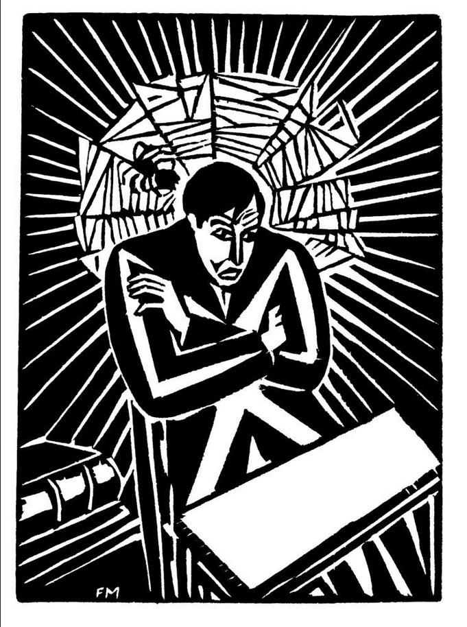
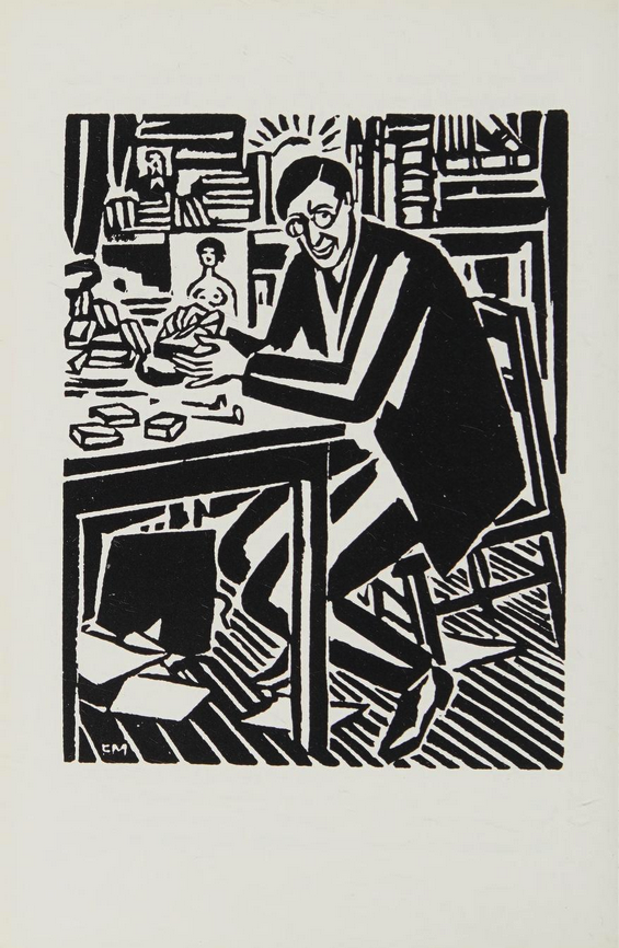
[2] Frans Masereel became most famous in Germany for the works translated as 25 Images of a Man’s Passion (1918) and Passionate Journey, or My Book of Hours (1919), but it is his later work, The Idea (1921), that first centers his experience as an artist, following his creation of an idea and how it fares in the world. It is easy to find similarities between The Idea’s artist and Masereel; take, for example, his self-portrait found before the title page of Journey (Figure 1). In “The Novel in Woodcuts: A Handbook,” Martin S. Cohen says it best: “Masereel and his hero are dressed alike, in black jacket and trousers, tieless…both are angular men, jutting everywhere, rather homely” (Cohen 184). While this is in reference to Journey, it applies here as well. On page one of Idea, we see the artist in a black jacket with a white “x” across the front, hair swept to the side, and seated at a desk alongside a stack of books, echoing the characteristics of the self-portrait. (Figure 2) Although he has made obvious reference to himself, the combination of the art style and medium prevents us from understanding him as Masereel explicitly, as does the length of his presence in the novel. We see him in the first nine pages and the last five, all in a seated position, with his only character traits being that he is an artist and his fatherly or romantic relationship to his idea.
Figure 1, Self-Portrait of Franz Masereel
Figure 2, The Artist about to have an idea, in The Idea
[3] Masereel was definitely inspired by medieval art, borrowing the concept of a “block book” and a book of hours from that period, but the presence of the artist mimics that of the period as well. Judith Walker Mann’s “Medieval Art” discusses various pieces and their characteristics, including a book of hours in illuminated manuscript from the mid-fifteenth century. Describing this piece, she states, “Many illuminated manuscripts bear no attributions. Few were signed; often artistic personalities can be identified only on the basis of a group of works that show stylistic affinities” (Mann 51). While Masereel does “sign” the work by having his title as author on the cover, only a few prints have a visible “FM” attribution, and the artist, while important to the creation of the work in both the narrative and reality if it is Masereel, is only distinguishable by those “stylistic affinities.”
[4] The style of the art that comprises the novel and is found in it is also reminiscent of the characteristics of medieval art Mann calls upon. Describing the movement generally, she says, “The naturalism and idealization of early Roman art gave way to a more simplified style that often deviated from the natural appearances of things; proportions were often distorted and some features were exaggerated over others” (Mann 2). Distorted proportions are also a typical characteristic of Masereel’s woodcut novels, as noted by Cohen in his description of the woodcut on page eight of Journey: “the hero is shown full length一so tall, in fact, that his feet do not even fit into the picture” (184). This figures in Idea as well, such as on page thirty-six. The Idea is exposing herself to a crowd in the city streets, but they all appear to be the same size as the buildings and it is difficult to tell one body apart from the next, aside from sets of bulging eyes.
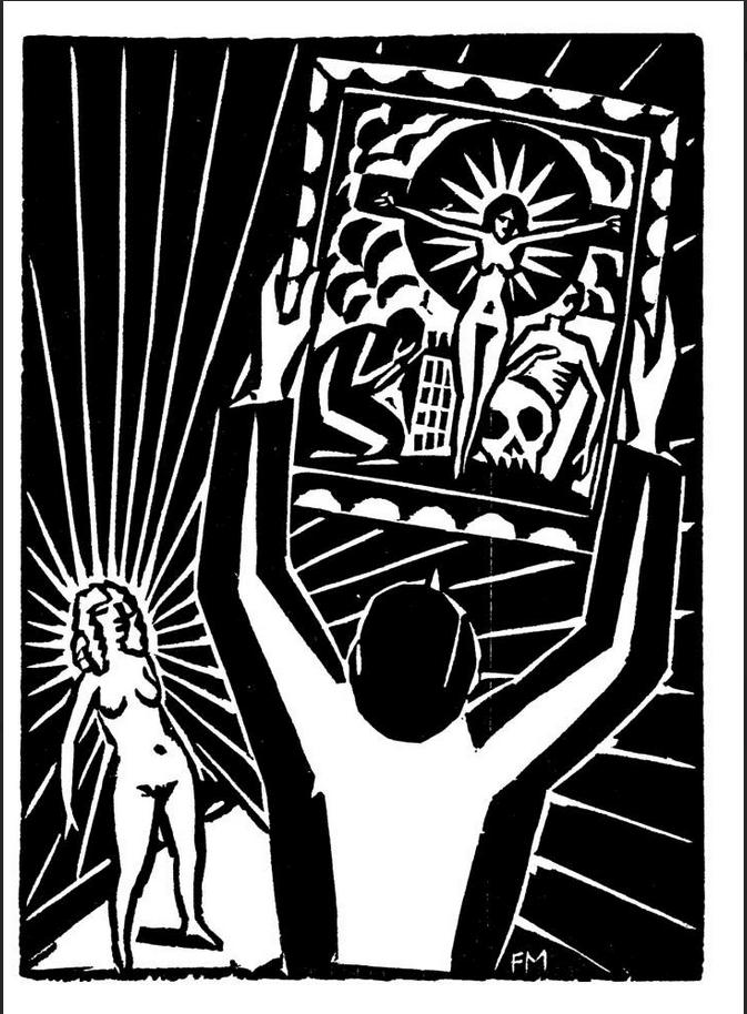
[5] But perhaps the woodcut that demonstrates the most striking similarity between Masereel’s art style and that of the medieval period is that of page eighty-one, where the artist frames the Idea for eternity in a painting that depicts her as a Christ-like figure. (Figure 3)
Figure 3, The Artist frames and hangs his Idea
[6] The painting is arranged so that the Idea is centered, arms outstretched onto what looks to be a cross, with a figure kneeling and weeping at her right, the city behind her, a skull at her left, and billowing clouds behind her. The most apparent similarity here is medieval art and Masereel’s fascination with religious subjects and imagery, but even the arrangement of figures echoes a lot of medieval art, particularly a piece from the mid-fifteenth century highlighted by Mann. The Crucifixion of St. Andrew (Mann 54) shows the saint centered on a tilted cross, fully-clothed and with white hair and a beard, distinguishing him from Christ just like the Idea’s nude feminine body and the artist only partially showing the cross. Both still allude to a connection to Christ. As Mann observes, “Noteworthy characteristics of the St. Andrew include the balanced yet varied arrangement of the figures on the page, the individualized and accomplished treatment of the faces of the onlookers, the prominent notes, and the short, wide hands” (55). In Idea, we see the skull and the weeping figure are not the same size but still balance the image by being on either side. In both pieces the arrangement is “varied” because we really cannot pinpoint where characters are standing or what perspective we should be using, as none of the elements of either piece are proportional. And while Masereel’s hands vary from long and slender to short and wide, the proportions are never correct.
[7] All of this changes with Lynd Ward, an artist who brought the woodcut novel to an American audience and brought a much stronger element of realism to the medium, much like the Renaissance did for art after medieval times. As David G. Stork explains in “Optics and Realism in Renaissance Art”:
[8] [Around 1425], Italian artists invented linear perspective. Based on a horizon line, a vanishing point, and orthogonal lines, or ‘visual rays,’ that lead the viewer’s eye to the vanishing point, this mathematical system created the illusion of space and distance on a flat surface and allowed artists to depict scenes in a more naturalistic fashion. Another technical innovation of the period is that artists were for the first time studying cadavers and developing an understanding of muscles and skeletal structure (83).
[9] We see this even in Ward’s first woodcut novel, Gods’ Man (1929). While the novel certainly retains some of the “cartoonish” style that Masereel established for the genre, Ward has a much more heightened sense of realism and anatomy evidenced by his attention to detail in hands. Take, for example, the thirteenth image of chapter one. The innkeeper’s hand is outstretched and we see each ligament is clearly defined, highlighting the bone structure. Additionally, the lines of his face and his undereye bags are clearly defined, as are the muscles of his neck and the inner parts of his ear. Masereel suggests these details simplistically, usually by just one line, but here Ward uses etching to create shadows. This is possible because he is using the “wood engraving method” as opposed to “the one properly called a ‘woodcut’” (Ward 770), a key difference he explains in his work, “The Way of Wood Engraving”:
[10] [Wood engraving] requires a block that is made by slicing a log of wood directly across the grain…Any cut made with an engraving tool will move freely in any direction because of the absence of grain. It will shear away the fibers of the wood somewhat below the surface and force out a curling sliver of wood. On the other hand, the plank block that is worked with a knife and gouges must take the direction of the grain into account. The knife must make cuts on both sides of a sliver of wood before it can be removed from the block. Gouges, of course, will operate in a way generally similar to gravers, moving more easily when cutting with the grain across it. (Ward 770-1)
[11] Because Masereel used the true woodcut form, he was not able to achieve the sophisticated level of detail that Ward has in his works, much like how medieval painters were not able to achieve realistic perspective and proportion because they did not have linear perspective. Renaissance artists and those working in realism afterward also paid a great deal of attention to the presence of brushstrokes in their art, or the lack thereof, to give it the intense realism they were going for, and we see that Ward’s employing of wood engraving allows us to forget that his works came from wood instead of directly from the artist’s hand.
[12] Ward also builds on Masereel with the plot of Gods’ Man by centering the Artist, tricked by the promise of success into making a deal with Death. This is a novel about the artist as celebrity, precisely what the Renaissance was so revolutionary for. As alluded to previously, art was typically unsigned up to this point, and scholars can only guess as to who may have painted what, while the masters of the Renaissance are names still familiar to us today, such as da Vinci and Michelangelo. Stork offers a theory on this, stating, “Many cultural forces set the stage for the new art, too. The Renaissance brought a rise in secularism and in classical ideals of focusing on humans in the here and now” (83). This idea of humanism brings the artist away from creating art just for the church or to glorify God, but for their own posterity, precisely what the Artist of Gods’ Man is intent on doing. Additionally, we see almost the entirety of the Artist’s life through the novel, just as our knowledge of the artists of the Renaissance increased because of their “celebrity” status in the time period, which has encouraged scholars to save their works and piece their lives together. While we do know a lot about the Artist, though, there are many moments where we are unable to fully understand his thought processes due to the lack of words, akin to what time and decay has done to our understanding of the Renaissance and its artists. This all changes, however, with the advent of what we know as the graphic novel from the end of the twentieth-century into the twenty-first.
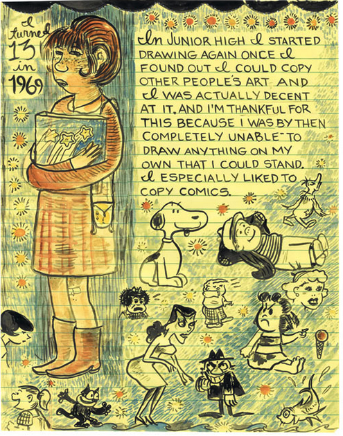
[13] Any of a number of graphic novels could have been used for this portion of the essay, as many are known for their distinct art styles and their emphasis on the artist. In fact, the new genre of the graphic memoir has given birth to innumerable works centered on the lives of their creators. But it is Lynda Barry’s What It Is (2008) that centers not only the artist’s life experiences, but her development as an artist. While the book becomes a writing seminar around page one-hundred-thirty-seven, the rest of it is pages of tales from Barry’s life with interspersed philosophical musings, often about her journey to become an artist and the roadblocks that prevented her. One of many examples of this comes much later in the book, where Barry writes, “I kept copying pictures all through highschool, and looking for more pictures to copy, which got me going to the downtown library. I loved old children’s books” (111). What is most interesting about this page is that we see Barry copying pictures in the upper right hand corner, and we can also infer that we are seeing the images she has copied separately on the left side and bottom right hand corner. As Christopher Borrelli says in his article, “Being Lynda Barry,” “Her art still bears the mark of a distracted doodler, and her writing, simultaneously bitter and open-hearted, remains the voice of a wounded child, with the bittersweet notes of an adult who has not forgotten a thing” (Borrelli 144-145). The images representing her doodles definitely look like doodles, but so does the image of her doing the work: lines overlap, color is minimal, and aspects are not fully pigmented with watercolor, like her face and arms or even her shirt, which has uneven coloring on the sleeve. The word is also incorporated directly into the images on the page, being handwritten and only somewhat distinguished from the doodles by haphazard borders. While the next page uses some speech bubbles, the text of the book is often in a paragraph form that expresses the author’s inner monologue, which we have not been privy to until this point. (See Figure 4) All of this information puts What It Is in a very unique position in the history of the graphic novel that is far beyond the developments we have seen thus far through the woodcut novel, as does every postmodern or contemporary piece in the history of art.
Figure 4, Lynda Barry doodles and writes in What It Is
[14] As previously stated, it is difficult to pinpoint one contemporary graphic novel to use for this section, and it is just as difficult to pinpoint one piece of art to represent the postmodern period of art history. But we can relate What It Is and Barry to a specific piece of art by a specific artist that parallels its achievements and style. Cy Twombly’s “Fifty Days at Iliam” is a series of massive canvases featuring abstract depictions of scenes from Homer’s Iliad. While the subject matter seems like something completely unrelated to Barry’s journey of self-discovery, there is a very prominent overlap between them: their preoccupation with tales and myths from Ancient Greece. A memorable portion of Barry’s history recounts her fascination with a monster she refers to as “the gorgon”, otherwise known as Medusa, a feminine creature with snakes for hair and the power to turn victims to stone (63-66). What makes this loose connection stronger, however, is that both artists place their respective myths into modern contexts. Barry makes her personal connection to the gorgon explicit, stating, “That I had a very gorgon-like mother never occurred to me…We never need certain monsters more than when we are children. And a furious woman with terrifying eyes and snakes for hair was the perfect monster for me” (66). Twombly’s work, however, takes some analysis of historical context to see the connection between his subject matter and his present moment, work that Mary Jacobus has fortunately done for us in the chapter “Achilles’ Horses, Twombly’s War” from her larger work Reading Cy Twombly: Poetry in Paint. Jacobus uses textual analysis of The Iliad in conjunction with notable moments around the time of Iliam’s creation, specifically those related to the Vietnam War, to understand how Twombly might be responding to the anxieties and devastations of his political atmosphere just as so many other artists were doing during the sixties and seventies (124). With this reading, we see that both artists are using their respective myths to understand and make sense of trauma that has impacted their lives through their art. While Barry’s trauma is at a personal level and Twombly’s is at a national and worldwide level, their art styles and mediums tackle them in similar ways.
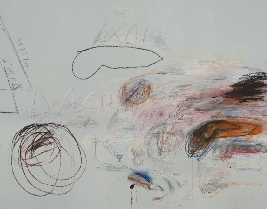
[15] According to the Philadelphia Museum of Art, where Iliam is being displayed, Twombly’s medium is oil, oil crayon, and graphite on canvas. Even without knowing the exact details, a casual viewer would be able to identify most of these materials, especially the oil crayon and canvas. Like Barry, Twombly makes no point of hiding his “brushstrokes” or coloring things in fully, leaving a great deal of his canvases blank and showing the trademark incomplete tread of an oil crayon instead of blending or going over it once again to make his lines completely solid. Barry also uses what might be considered casual or juvenile mediums, like yellow notebook paper and clippings from various sources, including the archives of a grade school teacher, both of which she makes explicitly known to her reader. Additionally, we see a presence of words within Twombly’s art, particularly in the canvas Achaeans in Battle. (Figure 5) Occasionally, we see labels in art to explain who or what something is, but here, words are intrinsic to our understanding of the scene and act as characters in the space. The canvas shows the chaos of war on the right hand side with a mix of oranges, reds, blues, and blacks. Within this we see the names of key figures in this battle, such as Thetis, Athena, Agamemnon, Hera, and Ajax. While Barry often represents her characters in ways that mimic life, the paragraphs that she uses to describe each scene represent Barry as the character of herself, looking back on past iterations of herself from her present moment.
Figure 5, Drawings and words in crayon and pencil in Cy Twombly’s Achaeans in Battle
[16] We also have an extremely heightened sense of who both of these artists are. While Borrelli mentions throughout his article that Barry is pretty much “off the grid,” she still gives interviews and talks, runs workshops for writers, and writes many autobiographical works, like What It Is. We have a wealth of information on Twombly as well: Jacobus’ book on Twombly runs to over two hundred pages, featuring many personal details of his life, and the Philadelphia Museum of Art alone contains twenty separate pieces of his art. This is partially due to the age of information we live in, but it is also due to the culture of the artist as celebrity, which has only increased since the Renaissance with social media and fan culture. At an interview with Barry, a fan is recorded by Borrelli as saying, “I want you to know how thankful I am for your creative choices. It's just a comic but it was important to me” (Borelli 151).
[17] So why has the artist grown in status in the graphic novel, and why are these artists clearly preoccupied with what we consider “high art”? As mentioned previously, Amy Peltz noticed a trend within art circles, specifically in pop art, to see comics and graphic novels in a limited way, as forms only to be borrowed from:
[18] Scholars, curators and critics often use the terms ‘cartoon’ and ‘comics’ as if they were specific visual descriptors rather than the media that encompass many styles…The continuing critical view of comics as ‘raw material’ for real art betrays a monolithic and ahistorical conception of the medium, ignoring its aesthetic development and bypassing alternative comics altogether一the comics that could most easily be recognized as fine art (9).
[19] The woodcut novel and the graphic novel are incredibly sophisticated mediums, as we have seen through their visual storytelling and the artistic style and prowess they require to be notable, but the art world still has bias against “cartoons” because of their connotations as casual reading in the newspaper comics section or as children’s fare with superhero comics. By following the development of art, then, the graphic novel demonstrates a history that the art world can relate to and find merit in, because so much of art is building on the masters that have come before. And in graphic novels that center the artist, the art community sees that familiar progression from art history again, while also realizing that these novels are and should be regarded as pieces of art instead of a bastard child of art and literature.
[20] While there is certainly a lot of evidence of the art community’s influence on the development of the graphic novel’s prestige, Peltz seems to believe that the literary community has caused this, stating, “Comics today have a place in high culture, but ever since Art Spiegelman’s Maus won a Pulitzer Prize Special Citation for Letters in 1992, they have been celebrated primarily as literature rather than as art, especially in the form of longer ‘graphic novels’” (9). This sentiment is echoed by Ivan Brunetti, a cartoonist quoted in Borrelli’s article about Barry: “Most importantly, I think it’s become increasingly known that she moved the medium closer to real literature” (Borrelli 145). Perhaps this is true; Alison Bechdel’s 2006 tragi-comic Fun Home is undeniably reliant on the written word and classic literature, and the visual poetry of Martin Vaughn-James’ The Cage (1975) is not complete without its mind-bending text. But while some contemporary graphic novels have moved toward literature, others have made a "visual turn" and feature minimal text (e.g. Richard McGuire's Here [2014]). Works like Barry's What It Is are doing a little bit of both, featuring pictures and words that do each other's jobs. It seems as though the graphic novel’s seduction of the literary community was at its height in the 90s with Maus’ Pulitzer Prize win, and then it took a turn back toward the visual around the late 2000s, with Peltz’s 2013 article tracking that change. She concludes her piece with this: “Maybe comics’ current visual turn is less an attempt to seduce the museum than a backlash against the literary gentrification of the graphic novel and the attendant academicization of the form…a fulfillment of [Art] Spiegelman’s vision of artists working with comics ‘in ways that won’t be happily contained anywhere, in books or walls’” (Peltz 13). Perhaps trying to fit the graphic novel into either of their parent mediums is a fruitless search because neither has the capacity to fully accept its legitimacy in either of their cannons. Perhaps it is time for the graphic novel to chart its own path as the legitimate and prestigious medium it is on its own.
Barry, Lynda. 2008. What It Is. Drawn & Quarterly.
Borrelli, Christopher. 2010. “Being LYNDA BARRY, “ in Kan, Katharine. Graphic Novels and
Comic Books. H. W. Wilson, pp. 144 - 151.
Cohen, Martin S. 1977. “The Novel in Woodcuts: A Handbook.” Journal of Modern Literature,
vol. 6, no. 2, pp. 171–95. JSTOR, http://www.jstor.org/stable/3831165.
Jacobus, Mary. 2016. “ACHILLES’ HORSES, TWOMBLY’S WAR.” Reading Cy Twombly:
Poetry in Paint, Princeton University Press, pp. 103–32. JSTOR, https://doi.org/10.2307/j.ctvc778q9.8.
Mann, Judith Walker. 1992. “Medieval Art.” Bulletin (St. Louis Art Museum), vol. 20, no. 3, pp.
1–68. JSTOR, http://www.jstor.org/stable/40716305.
Masereel, Frans. 2009. Passionate Journey. Dover Publications, Mineola.
Masereel, Frans. 2009. The Sun, The Idea, & Story Without Words: Three Graphic Novels. Dover
Publications, Mineola.
Peltz, Amy. 2013. “A Visual Turn: Comics and Art after the Graphic Novel.” Art in Print, vol. 2,
no. 6, pp. 8–14. JSTOR, http://www.jstor.org/stable/43045499.
Stork, David G. 2004. “Optics and Realism IN RENAISSANCE ART.” Scientific American, vol.
291, no. 6, pp. 76–83. JSTOR, http://www.jstor.org/stable/26060802.
Twombly, Cy. n.d. “Fifty Days at Illiam”. Philadelphia Museum of Art.
https://philamuseum.org/collection/object/85709. Cy Twombly Foundation.
Ward, Lynd. 2004. Gods’ Man: A Novel in Woodcuts. Dover Publications, Mineola.
Ward, Lynd. 1974. “The Way of Wood Engraving.” Storyteller Without Words: The Wood
Engravings of Lynd Ward. Harry n. Abrams, New York.